The Design Museum is situated on Kensington High Street, a beautiful building with fascinating exhibits inside. One recent exhibit looked at the graphic design aspects of political activism. Entitled ‘Hope to Nope: Graphics and Politics 2008 – 2018’, it sought to explore the evolving nature of design, particularly within the changing landscape of politics in the last decade. The exhibit showcased many beautiful designs, all likely familiar to those who have not only engaged in politics but simply logged onto Facebook in recent years. As soon as you walk in to the ‘Hope to Nope’ exhibit, after an odd descent down a steep staircase, you are greeted by a bright yellow wall, with an explanation for the exhibits existence. The explanation describes the “turbulent decade” we have experienced and how “graphic design, from election campaign posters to protest badges, has had a prominent role to play”. It also discusses how social media has “made it easier to spread political graphics” with “entirely new forms of visual communication” emerging, a precursor to the electronic exhibits that feature later showcasing the data of protests, activism and more in a visually accessible manner.
The exhibit is separated into three parts: ‘Power’, ‘Protest’ and ‘Personality’. Each one has its own story to tell and the exhibit is designed so that you must move through each one chronologically – there’s no skipping ahead.
The first, ‘Power’, shows us how power and authority can be asserted through graphic design but just as easily it can be subverted by those who seek to undermine you – “graphic design is everywhere and so easily appropriated”. One particular example, which is shown in the exhibition, is how “Coke’s logo was turned into ‘Choke’ by Greenpeace in a campaign against plastic bottles”. Another is an image of a VW Beetle with the phrase “Drive cleaner. Or just pretend to.”, a clear reference to the scandal involving Volkswagen’s emissions. Then there is an American flag with a blue stripe in the middle in support of the alternative campaign ‘Blue Lives Matter’ and a Star Wars Rogue One Poster with the likes of Donald Trump, Steve Bannon and Sean Hannity in place of the characters, both of which take a graphic design and change it to suit their own personal narrative.
There is also a clever visual graphic that showcases a Nazi swastika symbol transforming into the number 45, implying President Trump’s connection to Nazi supporters as he is the 45th President of the United States. It was created by artist Mike Mitchell, who made it available via Twitter. This “artwork was widely shared on social media and used in protests” following “Trump’s failure to condemn far-right violence in Charlottesville, Virginia”. It is a clever and quick way of getting your message across and Mitchell demonstrates his skills with design and visual graphics extremely well.
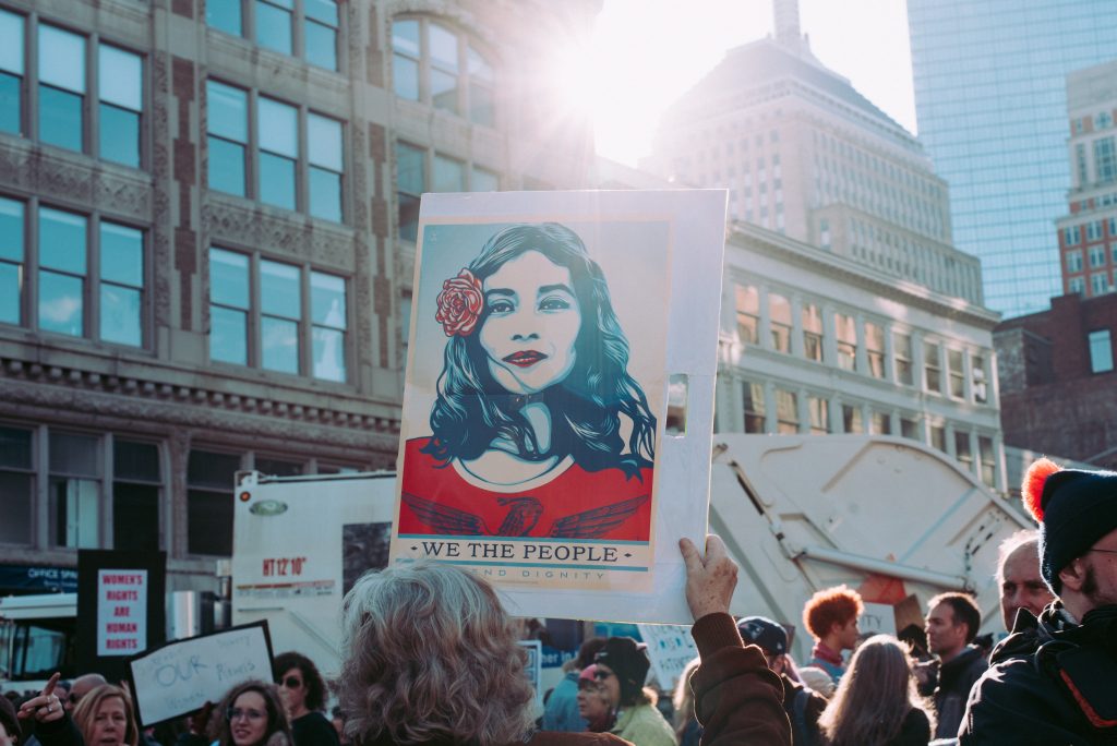
The second section, ‘Protest’, is primarily focused on the protests that have occurred around the world in the last decade for a myriad of reasons, showing how people have demonstrated their desire for something important and participated in global movements to seek change. The use of graphic design in protest, particularly on social media, was especially important during the Arab Spring in 2010, the Occupy Wall Street Protests in 2011, the Hong Kong Umbrella Movement in 2014 and the Women’s March in 2017. The exhbition brilliantly and interestingly displays the numerous posters, t-shirts and badges that were used to spread the word and gain support from the people. The exhibition states that “the internet and social media have galvanised mass demonstrations” with “posters, banners, placards and badges… made and shared digitally, expanding their reach and resonance.” There are small screens everywhere, cycling through the numerous digital designs of events such as the Hong Kong Umbrella Movement. A larger screen sits in one corner, with benches for visitors to sit and watch footage taken from protests in Catalonia, New York, South Africa and the Middle East. It makes you feel like you’re a part of something, or at least fuels the desire for instigating change.
The third section, ‘Personality’, is much smaller than the first two, tucked away in the back corner of the exhibition just before you leave. It looks at the cult of personality that surrounds many groups and people, how people seemingly idolise one person no matter what and will subsequently demonise the opposition as much as possible. It describes how “powerful leaders” with “personality cults” can be “ripe for satire and subversion”. President Donald Trump is a natural focus within this section, with his image having “lent itself best to becoming a satirical graphic icon”. An section of the wall shows nearly 50 different magazines featuring Donald Trump’s image or a graphic cartoon that subverts his image. There is Private Eye, Time, The New Yorker, New York Magazine, Forbes, The Economist and more, all featuring Donald Trump. Whether you agree or disagree with Trump’s politics, his face is everywhere. There is also a small booth, made to look like an old-fashioned genie machine at a carnival but it instead is a model of Trump which will play something he actually said and give you a ticket for “how great America’s future is” when the button is pressed. It is entertaining and laughable, but only when you forget that these are real statements.
The ‘Hope to Nope’ exhibit is much more than can be described in one article. In its essence, it is a visual product, a spectacle to behold and learn from. If you want to become more politically engaged, to see how integral design is in shaping political opinion and learn more about the activists that came before you, this exhibition is for you.
The ‘Hope to Nope’ exhibit is on at the Design Museum until August 12. Visit their website to learn more.